
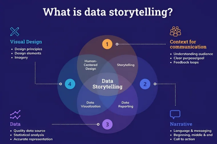
Data Storytelling: How to Tell a Great Story with Data
You already know that data matters. You collect it, analyze it, visualize it and present it.
Yet, despite all that effort, your audience may still walk away confused, unconvinced or uninterested.
That’s where data storytelling changes everything.
Data storytelling is not about adding pretty charts to a report. It’s about transforming raw data into insight, meaning and action. When done right, it helps people understand why something matters, not just what the numbers say.
Let’s break down how you can tell a great story with data; clearly, persuasively and memorably.
Read more: TDS Rate Chart for FY 2025-26 (AY 2026-27) PDF
Why Data Storytelling Is So Powerful
Humans are wired for stories, not spreadsheets.
Neuroscience shows that stories activate multiple parts of the brain including areas responsible for emotion, memory and decision making. Numbers alone activate only the language processing centers.
That’s why:
- A single compelling insight beats 20 KPIs on a dashboard
- A clear narrative outperforms a dense analytics report
- A story drives decisions, while data alone often leads to debate
In business intelligence, marketing analytics, product management, healthcare, finance and AI-driven decision systems, data storytelling is what turns insight into impact.
Start With the Audience, Not the Data
Here’s a hard truth:
The same dataset can tell multiple stories.
The right story depends entirely on who you’re talking to.
Before you touch a chart or write a sentence, ask yourself:
- Who is my audience?
- What decisions do they make?
- What do they already know?
- What do they care about most?
A CEO wants outcomes and risks.
A product manager wants user behavior and trends.
A marketing team wants attribution and ROI.
When you frame your story around their goals, your data becomes relevant instantly.
Define the Core Message First
Great data stories have one clear takeaway, not ten.
If your audience remembers only one thing, what should it be?
Examples:
- “Customer churn is driven more by onboarding friction than pricing.”
- “Our conversion rate dropped because mobile load time increased.”
- “Revenue growth is strong, but margins are silently eroding.”
This core message acts as your north star.
Every data point, visual, and sentence should support it or be removed.
Use a Clear Story Structure
Data storytelling works best when it follows a familiar narrative arc. One of the most effective structures is this:
1. Context – Set the Scene
Explain the situation and why it matters.
- What problem are we looking at?
- Why now?
- What’s at stake?
2. Conflict – Reveal the Insight
Introduce tension using data.
- What’s unexpected?
- What’s broken?
- What changed?
3. Resolution – Drive Action
Offer clarity and direction.
- What does this mean?
- What should we do next?
- What happens if we don’t?
This structure mirrors classic storytelling and it works just as well for analytics presentations and executive dashboards.
Choose the Right Data (Not All the Data)
One of the biggest mistakes in data storytelling is overloading the audience.
More data does not mean more clarity.
Instead:
- Focus on relevant metrics
- Eliminate vanity metrics
- Highlight trends, comparisons, and anomalies
- Use benchmarks and baselines for context
Ask yourself:
Does this data help explain or support my message?
If the answer is no, it doesn’t belong in the story.
Visualize Data to Clarify, Not Impress
Data visualization is a tool for understanding; not decoration.
Effective visuals:
- Reduce cognitive load
- Make patterns obvious
- Guide attention to what matters
Use:
- Line charts for trends over time
- Bar charts for comparisons
- Scatter plots for relationships
- Heatmaps for density and intensity
Avoid:
- 3D charts
- Excessive colors
- Unlabeled axes
- Charts that require explanation to understand
A great visualization should be understandable in five seconds.
Use Annotations and Narrative Cues
Don’t assume your audience will interpret charts the way you do.
Guide them.
Use:
- Titles that state the insight, not the metric
- Annotations to highlight key events
- Callouts for anomalies or inflection points
Instead of:
“Monthly Active Users by Region”
Try:
“User Growth Stalled in APAC After Q2 Product Change”
Your visuals should tell the story even without you speaking.
Add Meaning With Context and Comparison
Numbers without context are meaningless.
Always ground your data with:
- Time-based comparisons (month-over-month, year-over-year)
- Benchmarks (industry averages, targets, historical norms)
- Cause-and-effect explanations
For example:
- A 5% drop is alarming or insignificant; depending on the baseline
- A spike might be success or a data anomaly
Context turns metrics into insights.
Balance Logic and Emotion
Data storytelling is not manipulation; it is persuasion through clarity.
Logic builds credibility.
Emotion builds connection.
You can ethically use emotion by:
- Framing data around real users or customers
- Showing impact, not just performance
- Explaining consequences of inaction
For example:
Instead of saying:
“Support tickets increased by 18%”
Say:
“Nearly one in five customers needed help after checkout; breaking trust at a critical moment.”
Same data. Far more impact.
Be Honest About Uncertainty
Strong data storytellers don’t hide uncertainty; they explain it.
Be transparent about:
- Data limitations
- Assumptions
- Confidence intervals
- Potential bias
This builds trust and positions you as a credible analyst, not a salesperson for the data.
Decision-makers don’t need perfection.
They need clarity about risk.
Turn Insights Into Action
A data story that doesn’t lead to action is just entertainment.
Always end with:
- Clear recommendations
- Prioritized next steps
- Expected outcomes
- Trade-offs and risks
For example:
- What should we test?
- What should we stop doing?
- Where should we invest?
Your goal is not to show that you analyzed data.
Your goal is to help someone decide.
Read More: Top 10 Storytelling Bots: The Future of Storytelling with AI
Common Data Storytelling Mistakes to Avoid
- Starting with charts instead of questions
- Dumping dashboards instead of telling a story
- Using jargon instead of plain language
- Treating all stakeholders the same
- Hiding the conclusion until the end
Remember: clarity beats cleverness every time.
Read More: Storyteller App: Create, Share and Experience Stories
Data Storytelling Is a Skill You Can Practice
You don’t need to be a designer, journalist, or novelist to master data storytelling.
You need:
- Curiosity about why the data looks the way it does
- Empathy for your audience
- Discipline to simplify
- Courage to focus on what matters
Every presentation, report, and dashboard is a chance to get better.
Final Thought: Make Data Work for Humans
Data doesn’t drive decisions.
People do.
Your job as a data storyteller is to bridge that gap—to translate complexity into clarity, and insight into action.
When you tell a great story with data, you don’t just inform.
You influence, inspire, and enable better decisions.
And that’s where data delivers its true value.